
In this article, we'll learn how to create reusable react components that can be used between projects and teams with proptypes. We've previously used props in our components, and we normally expect them to be a specific type or combination of types. React has a mechanism for creating and verifying these types, which allows us to simply provide a component API. The prop-types object provides a variety of types that we may use to specify what type a component's prop should be.
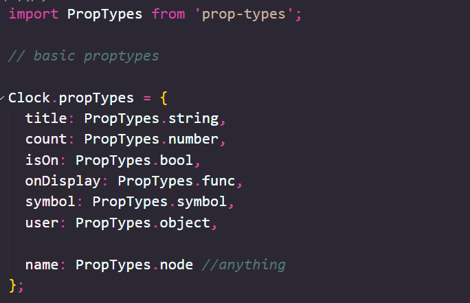
From within this prop, we can define an object with the key of a prop as the name of the prop we are defining and a value that specifies the type (or types) it should be declared as. React has a lot of types to choose from, exported on the PropTypes object, and even allows for us to define a custom object type. The basic types include String, Symbol, Object, and anything. For example, the Header component we created receives a parameter named title, which we expect to be a string. We can specify its type as a strings.For the implementation code I have added few more parameters to show how to implement all the basic prop types.
A function allows us to interact between a child component and a parent component. We'll utilize this technique frequently when we need to control a parent component from a child. Our props support iterable collections. We've previously seen how to achieve this as we go through an array of activities in our timeline app. To specify a component's prototype as an array, we use the PropTypes.array annotation. We can also use PropTypes.arrayOf([]) to specify that an array only contains objects of a specific type.
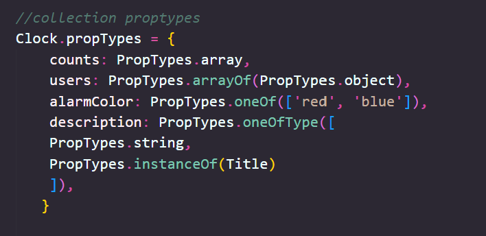
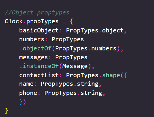
It's possible to describe an object that can be one of a few different types as well by using PropTypes.oneOfType([types]).It's possible to define object proptypes that need to be of a certain shape or instance of a certain class. These can written as below-
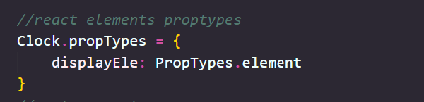
We can also pass on React elements from a parent component to a child component. This is extremely useful for creating templates and giving customization with them. When we utilize an element, React assumes that we can receive a single child component. That is, we will not be able to send multiple components.
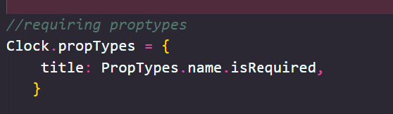
Setting a prop as required is very useful for times when the component is dependent upon a prop to be passed in by its parent component and won't work without it. It's possible to require a prop to be passed to a component by appending any of the proptype descriptions with .isRequired
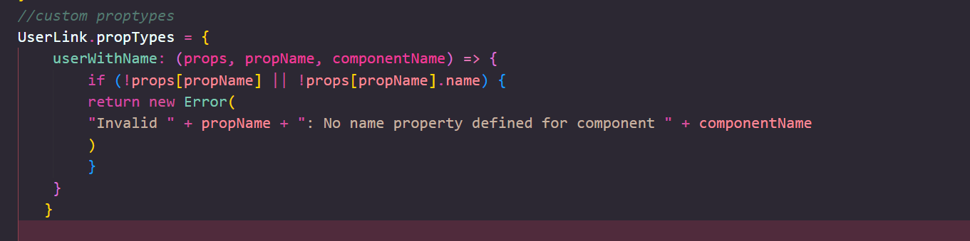
it's also possible to pass a function to define custom types. We can do this for a single prop or to validate arrays. The one requirement for the custom function is that if the validation does not pass, it expects we'll return an Error object: type example
Sometimes we want to be able to set a default value for a prop. For instance, the header component might not require a title to be passed. If it's not, we'll still want a title to be rendered, so we can define a common title instead by setting its default prop value. To set a default prop value, we can use the defaultProps object key on the component.

Building reusable components with the propTypes and defaultProps properties of components is always a good idea. These are some of the proptypes included in React . We'll be using them regularly as we work on our React apps. In the following post, we will style our components and add interactions to them. The whole code for the post is available on my GitHub repository.
« Read Previous Article in this Series Read Next Article in this Series »